Dark Mode
Ionic makes it easy to change the themes of your app, including supporting dark color schemes. With growing support for dark mode in native apps, developers are now looking to add it to their apps to support user preferences.
Using Media Queries
The first way to enable dark mode is by using the CSS media query for the user's preferred color scheme. This media query will hook into the system setting of the user's device and apply the theme if a dark mode is enabled.
@media (prefers-color-scheme: dark) {
  :root {
    /* dark mode variables go here */
  }
}
Currently, the prefers-color-scheme media query has limited browser support, so users will not be able to benefit from having the dark mode applied using this media query in certain browsers. However, the dark mode can still be applied by using a CSS class fallback.
CSS Class Fallback
As a fallback method for devices that don't support the media query, the dark mode can be applied by styling a CSS selector and applying the class to the document body.
@media (prefers-color-scheme: dark) {
  :root {
    /* Dark mode variables go here */
  }
}

/* Fallback for older browsers or manual mode */
body.dark {
  /* Dark mode variables go here */
}
With the variables targeting the body.dark selector, all that is needed now is to add the class to the <body> in the app. This can be done in a variety of ways depending on the framework your app is built with.
Notice that the variables should be in both places in this example. We can use JavaScript in order to avoid setting the variables in two places.
Combining with JavaScript
In order to keep the CSS variables written once and avoid having to update them in multiple places, the fallback and class can be combined by using JavaScript to check the value of the prefers-color-scheme media query and adding the dark class if the preference is dark. Here's what the CSS would look like:
body.dark {
  /* Dark mode variables go here */
}
Notice that the variables above are only in the body.dark selector now, and the prefers-color-scheme media query has been removed.
Automatically Enable Dark Mode
In the JavaScript, the dark class can be added to the <body> by checking if the document matches the media query using matchMedia(). This will enable dark mode to still work based on the user preference.
// Use matchMedia to check the user preference
const prefersDark = window.matchMedia('(prefers-color-scheme: dark)');

toggleDarkTheme(prefersDark.matches);

// Listen for changes to the prefers-color-scheme media query
prefersDark.addEventListener('change', (mediaQuery) => toggleDarkTheme(mediaQuery.matches));

// Add or remove the "dark" class based on if the media query matches
function toggleDarkTheme(shouldAdd) {
  document.body.classList.toggle('dark', shouldAdd);
}
Tip: make sure to view the Codepen below in a supported browser and then try changing the system preferences on your device between light & dark mode. Here's how to enable dark mode on Windows 10 and how to enable it on a Mac.
Manually Toggle Dark Mode
In addition to calling toggleDarkTheme() when the app loads and when the media query changes, the toggleDarkTheme() function could be called by the app, such as when a user changes a toggle, to switch between the light and dark themes:
// Query for the toggle that is used to change between themes
const toggle = document.querySelector('#themeToggle');

// Listen for the toggle check/uncheck to toggle the dark class on the <body>
toggle.addEventListener('ionChange', (ev) => {
  document.body.classList.toggle('dark', ev.detail.checked);
});

const prefersDark = window.matchMedia('(prefers-color-scheme: dark)');

// Listen for changes to the prefers-color-scheme media query
prefersDark.addEventListener('change', (e) => checkToggle(e.matches));

// Called when the app loads
function loadApp() {
  checkToggle(prefersDark.matches);
}

// Called by the media query to check/uncheck the toggle
function checkToggle(shouldCheck) {
  toggle.checked = shouldCheck;
}
Adjusting System UI Components
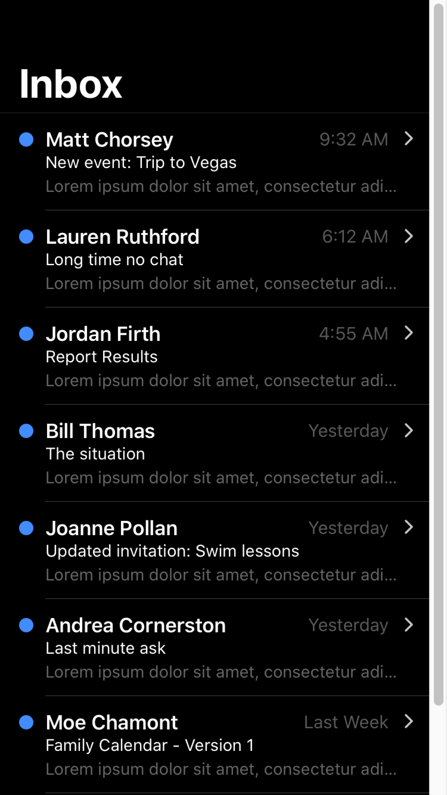
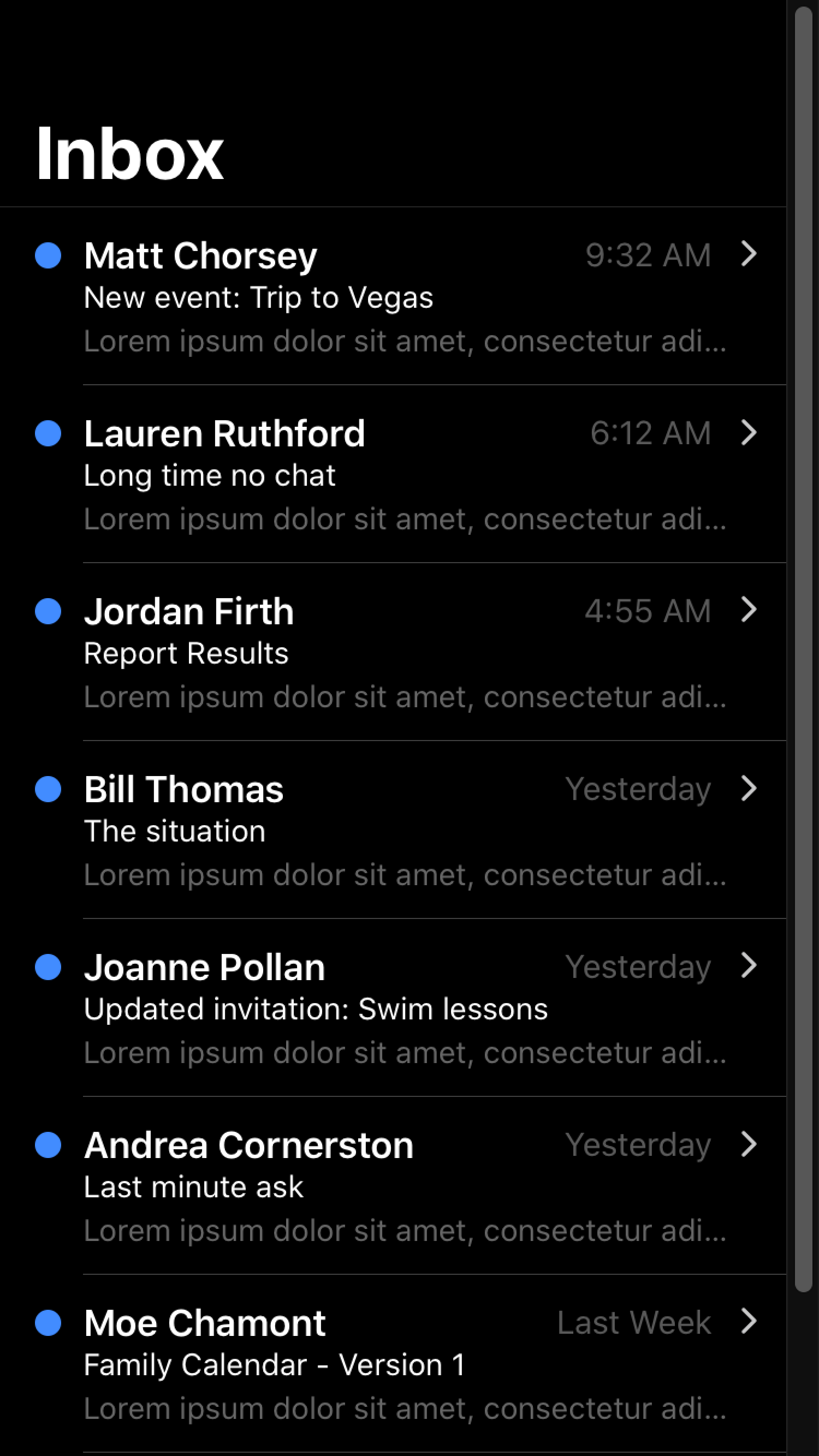
When developing a dark theme, you may notice that certain system UI components are not adjusting to dark mode properly. To fix this you will need to specify the color-scheme. See the browser compatibility for color-scheme for details on cross browser support.
While you may be mainly using Ionic components instead of only native components, color-scheme can also affect aspects of your application such as the scrollbar. In order to use color-scheme you will need to add the following HTML to the head of your application:
<meta name="color-scheme" content="light dark" />
This allows the page to indicate which color scheme it is comfortable being rendered with. Alternatively, you can add the following CSS to do this on a per-element basis:
color-scheme: light dark;
| Default scrollbar | Scrollbar with color-scheme |
|---|---|
 |  |
For more information regarding color-scheme please see https://web.dev/color-scheme/.
color-scheme does not apply to the keyboard. For details on how dark mode works with the keyboard, see Keyboard Documentation.
For developers looking to customize the theme color under the status bar in Safari on iOS 15 or the toolbar in Safari on macOS, see theme-color Meta.
Ionic Dark Theme
Ionic has a recommended theme for variables to use in order to get a dark mode based on the device running the app. It can be broken down into the following parts:
- Changing the default Ionic colors for all modes to complement the dark background in the
body.darkselector. - Setting variables for the dark theme on
iosdevices. - Setting variables for the dark theme on
mddevices.
The following code can be copied and pasted into an app to get Ionic's dark theme. We add the dark class to the document body using JavaScript as mentioned in the combining with JavaScript section. The dark mode will not be enabled until the dark class is added to the document body.
For more information on the variables that are being changed, including other variables that can be added to further customize, see Themes.
/*
 * Dark Colors
 * -------------------------------------------
 */

body.dark {
  --ion-color-primary: #428cff;
  --ion-color-primary-rgb: 66, 140, 255;
  --ion-color-primary-contrast: #ffffff;
  --ion-color-primary-contrast-rgb: 255, 255, 255;
  --ion-color-primary-shade: #3a7be0;
  --ion-color-primary-tint: #5598ff;

  --ion-color-secondary: #50c8ff;
  --ion-color-secondary-rgb: 80, 200, 255;
  --ion-color-secondary-contrast: #ffffff;
  --ion-color-secondary-contrast-rgb: 255, 255, 255;
  --ion-color-secondary-shade: #46b0e0;
  --ion-color-secondary-tint: #62ceff;

  --ion-color-tertiary: #6a64ff;
  --ion-color-tertiary-rgb: 106, 100, 255;
  --ion-color-tertiary-contrast: #ffffff;
  --ion-color-tertiary-contrast-rgb: 255, 255, 255;
  --ion-color-tertiary-shade: #5d58e0;
  --ion-color-tertiary-tint: #7974ff;

  --ion-color-success: #2fdf75;
  --ion-color-success-rgb: 47, 223, 117;
  --ion-color-success-contrast: #000000;
  --ion-color-success-contrast-rgb: 0, 0, 0;
  --ion-color-success-shade: #29c467;
  --ion-color-success-tint: #44e283;

  --ion-color-warning: #ffd534;
  --ion-color-warning-rgb: 255, 213, 52;
  --ion-color-warning-contrast: #000000;
  --ion-color-warning-contrast-rgb: 0, 0, 0;
  --ion-color-warning-shade: #e0bb2e;
  --ion-color-warning-tint: #ffd948;

  --ion-color-danger: #ff4961;
  --ion-color-danger-rgb: 255, 73, 97;
  --ion-color-danger-contrast: #ffffff;
  --ion-color-danger-contrast-rgb: 255, 255, 255;
  --ion-color-danger-shade: #e04055;
  --ion-color-danger-tint: #ff5b71;

  --ion-color-dark: #f4f5f8;
  --ion-color-dark-rgb: 244, 245, 248;
  --ion-color-dark-contrast: #000000;
  --ion-color-dark-contrast-rgb: 0, 0, 0;
  --ion-color-dark-shade: #d7d8da;
  --ion-color-dark-tint: #f5f6f9;

  --ion-color-medium: #989aa2;
  --ion-color-medium-rgb: 152, 154, 162;
  --ion-color-medium-contrast: #000000;
  --ion-color-medium-contrast-rgb: 0, 0, 0;
  --ion-color-medium-shade: #86888f;
  --ion-color-medium-tint: #a2a4ab;

  --ion-color-light: #222428;
  --ion-color-light-rgb: 34, 36, 40;
  --ion-color-light-contrast: #ffffff;
  --ion-color-light-contrast-rgb: 255, 255, 255;
  --ion-color-light-shade: #1e2023;
  --ion-color-light-tint: #383a3e;
}

/*
 * iOS Dark Theme
 * -------------------------------------------
 */

.ios body.dark {
  --ion-background-color: #000000;
  --ion-background-color-rgb: 0, 0, 0;

  --ion-text-color: #ffffff;
  --ion-text-color-rgb: 255, 255, 255;

  --ion-color-step-50: #0d0d0d;
  --ion-color-step-100: #1a1a1a;
  --ion-color-step-150: #262626;
  --ion-color-step-200: #333333;
  --ion-color-step-250: #404040;
  --ion-color-step-300: #4d4d4d;
  --ion-color-step-350: #595959;
  --ion-color-step-400: #666666;
  --ion-color-step-450: #737373;
  --ion-color-step-500: #808080;
  --ion-color-step-550: #8c8c8c;
  --ion-color-step-600: #999999;
  --ion-color-step-650: #a6a6a6;
  --ion-color-step-700: #b3b3b3;
  --ion-color-step-750: #bfbfbf;
  --ion-color-step-800: #cccccc;
  --ion-color-step-850: #d9d9d9;
  --ion-color-step-900: #e6e6e6;
  --ion-color-step-950: #f2f2f2;

  --ion-item-background: #000000;

  --ion-card-background: #1c1c1d;
}

.ios body.dark ion-modal {
  --ion-background-color: var(--ion-color-step-100);
  --ion-toolbar-background: var(--ion-color-step-150);
  --ion-toolbar-border-color: var(--ion-color-step-250);
  --ion-item-background: var(--ion-color-step-150);
}

/*
 * Material Design Dark Theme
 * -------------------------------------------
 */

.md body.dark {
  --ion-background-color: #121212;
  --ion-background-color-rgb: 18, 18, 18;

  --ion-text-color: #ffffff;
  --ion-text-color-rgb: 255, 255, 255;

  --ion-border-color: #222222;

  --ion-color-step-50: #1e1e1e;
  --ion-color-step-100: #2a2a2a;
  --ion-color-step-150: #363636;
  --ion-color-step-200: #414141;
  --ion-color-step-250: #4d4d4d;
  --ion-color-step-300: #595959;
  --ion-color-step-350: #656565;
  --ion-color-step-400: #717171;
  --ion-color-step-450: #7d7d7d;
  --ion-color-step-500: #898989;
  --ion-color-step-550: #949494;
  --ion-color-step-600: #a0a0a0;
  --ion-color-step-650: #acacac;
  --ion-color-step-700: #b8b8b8;
  --ion-color-step-750: #c4c4c4;
  --ion-color-step-800: #d0d0d0;
  --ion-color-step-850: #dbdbdb;
  --ion-color-step-900: #e7e7e7;
  --ion-color-step-950: #f3f3f3;

  --ion-item-background: #1e1e1e;

  --ion-toolbar-background: #1f1f1f;

  --ion-tab-bar-background: #1f1f1f;

  --ion-card-background: #1e1e1e;
}